
Real Estate Market Analysis Explained: Investor's Guide
- Rey Rey Rodriguez

- Aug 6
- 14 min read

A real estate market analysis is a structured, top-down evaluation of supply and demand conditions across a defined geographic area that tells you whether a market, submarket, or specific deal deserves your capital right now. The process moves from metro-level trends down to neighborhood fundamentals and finally to property-level numbers, giving you a layered picture no single metric can provide. Before you spend hours pulling data, run this five-step starter checklist to confirm you’re working the right problem:
Define your geography. Pin the metro, then the submarket, then the target neighborhood. Vague geography produces vague conclusions.
Gather comps and current rents. Pull at least 5–10 comparable sales and 5–10 active rental listings from your local MLS or Zillow/Redfin.
Calculate core metrics. Run NOI, cap rate, cash-on-cash return, and price-to-rent ratio before anything else.
Stress-test your assumptions. Drop rent 5%, add one month of vacancy, and spike expenses 15%. If the deal still works, keep going.
Decide your next action. Make an offer, pass, or flag the market for a future cycle. Analysis without a decision is just research.
Pro Tip: Before you open a spreadsheet, check the rental property quick framework to filter out weak deals in under five minutes. Most properties fail at this stage, which saves you hours of deeper analysis on deals that were never viable.
Table of Contents
What does a real estate market analysis actually cover?
Investors often confuse two distinct tools: a real estate market analysis and a comparative market analysis (CMA). Using the wrong one for your objective is like checking tire pressure when you need to know if the engine runs. According to RealAnalytica, a market analysis is top-down, spanning three tiers: macro (MSA/city trends), micro (neighborhood characteristics), and property-specific deal metrics. A CMA, by contrast, is bottom-up, built to price one specific property by comparing it to recent nearby sales.

Dimension | Market Analysis | Comparative Market Analysis (CMA) |
Direction | Top-down (metro → neighborhood) | Bottom-up (property → comps) |
Primary output | Market health score, investment thesis | Estimated list or offer price |
Who uses it | Investors, developers, portfolio managers | Buyers, sellers, listing agents |
Data scope | Vacancy, absorption, rent growth, demographics | Recent sales, price per sq ft, condition adjustments |
Typical use case | Market entry, underwriting, portfolio allocation | Pricing a listing, making an offer |
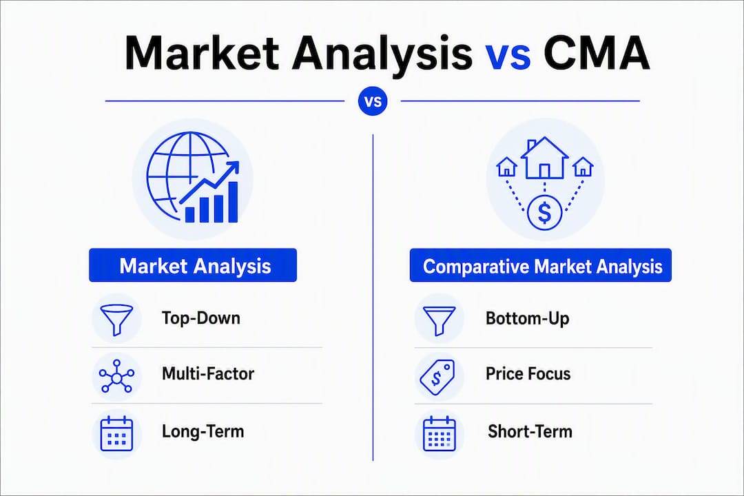
The two tools answer different questions. A market analysis tells you whether a market is worth entering and at what price band. A CMA tells you what a specific property is worth relative to its immediate peers. Experienced investors run both: the market analysis sets the investment thesis, and the CMA validates whether the deal price fits inside it.
Common use cases for a full market analysis include:
Investment underwriting: Confirming that rent growth, vacancy trends, and cap-rate compression support your projected returns before you commit capital.
Market-entry decisions: Evaluating whether a new metro or submarket belongs in your portfolio based on employment, population, and supply pipeline data.
Portfolio rebalancing: Identifying which markets are peaking and which are early-cycle, so you can allocate capital where the risk-adjusted return is strongest.
The Harvard Business School “real estate diamond” framework formalizes this multi-factor approach by requiring you to evaluate Product, People, External environment, and Capital markets together. Relying on a single metric, even cap rate, gives you a partial picture at best.
Which metrics and formulas do you actually need?
Think of these metrics as a dashboard, not a checklist. Each one answers a specific question about market health or deal quality. Knowing the formula is step one; knowing what a bad number looks like is what separates disciplined investors from optimistic ones.

Metric | Formula | What it indicates | Red flag |
NOI | Gross rents − operating expenses (incl. CapEx reserve) | True annual income before debt service | Seller proforma excludes CapEx or vacancy |
Cap rate | NOI ÷ purchase price | Unlevered yield; market pricing benchmark | Cap rate < loan constant = negative leverage |
Cash-on-cash | Annual pre-tax cash flow ÷ total cash invested | Return on actual dollars deployed | Below 6–8% in most U.S. markets |
Price-to-rent | Purchase price ÷ annual gross rent | Relative affordability; buy vs. rent signal | Above 20 suggests renting is cheaper than owning |
Gross rental yield | — | Quick income screen before expenses | Below 7% warrants scrutiny in most markets |
Days on market (DOM) | Average days from list to contract | Demand velocity | Rising DOM signals softening demand |
Vacancy rate | — | Supply-demand balance | Above 8–10% in a stabilized submarket |
Absorption rate | Units sold ÷ total available units per month | How fast inventory clears | Below 15–20% signals a buyer’s market |
Rent growth | — | Income trajectory | Flat or negative over 12 months |
DSCR | NOI ÷ annual debt service | Debt coverage cushion | Below 1.20 on most conventional loans |
Loan constant | Annual debt service ÷ loan amount | True cost of debt as a yield | Higher than cap rate = cash-flow drag |
A few of these deserve extra attention. NOI is only as reliable as the CapEx reserve you build into it. Omitting a capital expenditure reserve, which covers roof replacements, HVAC systems, and major repairs, produces a fictional NOI that makes bad deals look attractive. Model it as a line item every time.
The relationship between cap rate and loan constant is one of the most overlooked signals in deal analysis. Running two leverage clocks tells you two different things: comparing cap rate to the interest rate shows the impact on long-term wealth accumulation, while comparing cap rate to the loan constant shows the impact on monthly cash flow. A deal where the cap rate sits below the loan constant is cash-flow negative from day one, regardless of what the appreciation story looks like.
Quick formula examples:
NOI: $24,000 gross rent − $9,600 expenses (incl. CapEx reserve) = $14,400 NOI
Cap rate: $14,400 ÷ $200,000 purchase price = 7.2%
Cash-on-cash: $5,200 annual cash flow ÷ $50,000 cash invested = 10.4%
Price-to-rent: $200,000 ÷ $24,000 = 8.3 (well below the 20 caution threshold)
Where do you find reliable U.S. market data?
Data quality determines analysis quality. Pulling numbers from a single source, especially a seller’s proforma, is one of the fastest ways to underwrite a bad deal with confidence. Here is how the major U.S. sources stack up, from free to paid.
Free public sources:
Local MLS: The most accurate source for recent sales, days on market, list-to-sale price ratios, and active inventory. Access requires a licensed agent or MLS membership in most markets.
U.S. Census Bureau: Population trends, household formation, income levels, and housing unit counts by metro and census tract. The American Community Survey (ACS) is the workhorse for demographic inputs.
Bureau of Labor Statistics (BLS): Employment by sector, unemployment rates, and wage trends by MSA. Job growth is one of the strongest leading indicators for rental demand.
County assessor: Tax history, assessed values, building characteristics, and ownership records. Free in most U.S. counties through the assessor’s public portal. Useful for verifying seller-stated expenses and property age.
FHFA House Price Index: Tracks home price appreciation by metro and census division. Useful for benchmarking price growth against national trends.
U.S. Census Bureau — New Residential Construction: Building permits and housing starts by region. Rising permits in a submarket signal incoming supply that could pressure rents and vacancy.
HUD: Fair Market Rents (FMRs) by county, Section 8 payment standards, and housing assistance data. Critical for investors evaluating voucher-assisted tenancies.
Zillow, Redfin, Realtor.com: Useful for quick rent estimates, price history, and neighborhood-level trends. Treat these as directional inputs, not ground truth. Zillow’s Zestimate and rent estimates carry meaningful error margins in thin markets.
Paid and subscription sources:
CoStar / LoopNet: The institutional standard for commercial real estate data. Vacancy, absorption, asking rents, and comp sales for office, retail, industrial, and multifamily. CoStar subscriptions are expensive; LoopNet offers a free tier with limited data.
Placer.ai: Foot-traffic and mobility data by location. Particularly useful for retail and mixed-use analysis, where consumer visitation patterns drive underwriting assumptions.
Minimum viable data set when speed or budget is limited: Start with MLS comps, Census ACS demographic data, BLS employment figures, and county assessor records. These four free sources cover the core inputs for most residential investment decisions. Add Zillow or Redfin for a quick rent-range sanity check, then layer in paid sources only when the deal size justifies the cost.
Different deal types demand different data priorities. A long-term rental analysis leans on MLS comps, BLS employment, and Census household data. A short-term rental (STR) needs occupancy and ADR data from platforms like AirDNA. A BRRRR deal requires after-repair value (ARV) comps and contractor cost estimates. The analytical framework stays the same across deal types; the inputs change.
How do you run a market analysis from start to finish?
A repeatable workflow prevents you from skipping steps under deal pressure. Here is the full process, with time and cost estimates at each stage.
Define your objective and geography (30–60 minutes, free). Write one sentence: what decision does this analysis support? Then define three geographic rings: the metro/MSA, the target submarket or zip code, and the specific neighborhood or street corridor. Vague geography is the most common reason analyses produce useless conclusions.
Collect market-level data (2–4 hours, mostly free). Pull Census ACS data for population growth, household income, and renter-to-owner ratios. Pull BLS employment data for the MSA. Check building permits for the submarket. Note the vacancy rate and absorption rate from MLS or a local broker report.
Collect property-level comps (1–2 hours, free with MLS access). Pull 5–10 comparable sales (same property type, similar size, within 0.5–1 mile, sold within 6–12 months). Pull 5–10 active rental listings for the same product type. Adjust for condition, size, and amenity differences.
Calculate your metrics (1–2 hours, free). Build a simple spreadsheet. Run NOI with a CapEx reserve included, cap rate, cash-on-cash, DSCR, and loan constant. Cross-check your rent assumption against MLS comps and Redfin/Zillow data. For a deeper look at how to analyze a rental property deal, work through each metric systematically before moving to stress tests.
Build a one-page market snapshot. Populate these fields:
Metro indicators: population growth rate, employment growth rate, unemployment rate
Submarket rent range: low/mid/high for your target product type
Vacancy rate and trend (rising, flat, falling)
Cap-rate band for the submarket (e.g., 6.0–7.5% for SFR)
Typical days on market
Key demand drivers (major employers, university, transit corridor)
Near-term risks (new supply pipeline, employer contraction, regulatory changes)
Run stress tests (30–60 minutes, free). Apply the three standard shocks: rent down 5%, one extra month of vacancy, and operating expenses up 15%. Recalculate NOI, cash-on-cash, and DSCR under each scenario. If DSCR drops below 1.0 under any single shock, the deal has insufficient cushion.
Synthesize your recommendation (30 minutes, free). Write one paragraph: buy, hold, or pass, with the specific metric that drove the decision. This forces clarity and creates a record you can revisit.
Total time estimate: 6–10 hours for a thorough residential analysis using free sources. Add 2–4 hours if you’re pulling paid data or running a commercial deal. Paid tools (CoStar, Placer.ai) can run from a few hundred dollars per month to several thousand for enterprise access.
Pro Tip: Analyze rental deals in seconds using a standardized template so your inputs stay consistent across every deal you evaluate. Inconsistent inputs are harder to catch than wrong inputs.
Worked example: single-family rental in Southern New Jersey
Here are the deal inputs for a hypothetical SFR in a Southern New Jersey suburb:
Purchase price: $220,000
Expected monthly rent: $2,100 ($25,200/year)
Operating expenses (taxes, insurance, maintenance, property management at 10%, CapEx reserve): $10,584/year (42% of gross rent)
Loan: $176,000 at 7.25% interest, 30-year amortization
Annual debt service: approximately $14,424
Cash invested (20% down + closing costs): $48,000
Base-case calculations:
NOI: $25,200 − $10,584 = $14,616
Cap rate: $14,616 ÷ $220,000 = 6.6%
Annual cash flow: $14,616 − $14,424 = $192
Cash-on-cash: $192 ÷ $48,000 = 0.4% (very thin)
DSCR: $14,616 ÷ $14,424 = 1.01 (barely above 1.0)
Loan constant: $14,424 ÷ $176,000 = 8.2%
Price-to-rent: $220,000 ÷ $25,200 = 8.7
The cap rate of 6.6% sits below the loan constant of 8.2%, which means debt is dragging cash flow from day one. DSCR of 1.01 leaves almost no margin for error.
Stress test 1 — Rent down 5% + one extra vacancy month: Adjusted gross rent: $25,200 × 0.95 = $23,940, minus one month ($1,995) = $21,945. Adjusted NOI: $21,945 − $10,584 = $11,361. Adjusted DSCR: $11,361 ÷ $14,424 = 0.79 — the deal fails to cover debt service. Annual cash flow: −$3,063.
Stress test 2 — Operating expenses up 15% (insurance spike + maintenance): Adjusted expenses: $10,584 × 1.15 = $12,172. Adjusted NOI: $25,200 − $12,172 = $13,028. Adjusted DSCR: $13,028 ÷ $14,424 = 0.90 — still below 1.0. Annual cash flow: −$1,396.
Stress-testing for a modest bad year is a practical litmus test: if the deal fails under a single moderate shock, the price is likely wrong, not the analysis.
Decision box:
Scenario | DSCR | Cash flow | Verdict |
Base case | 1.01 | $192/yr | Marginal — no cushion |
Rent −5% + 1 month vacancy | 0.79 | −$3,063/yr | Skip — fails debt coverage |
Expenses +15% | 0.90 | −$1,396/yr | Skip — fails debt coverage |
Verdict: Skip at $220,000. The deal passes on price-to-rent but fails every stress test. A purchase price near $195,000–$200,000 would push the cap rate above the loan constant and restore a workable DSCR. Use the analysis to negotiate, not to walk away permanently.
How do you interpret results and avoid costly mistakes?
Numbers tell you what happened; judgment tells you what to do next. A few interpretation rules prevent the most common errors.
Reading the leverage relationship: When cap rate exceeds the loan constant, debt amplifies returns. When cap rate falls below the loan constant (as in the example above), debt destroys cash flow even when the property appreciates. Many investors focus only on DSCR and miss this distinction entirely.
Negative leverage warning: A cap rate below the interest rate signals that you are paying more for money than the asset earns unlevered. This is not automatically a deal-killer in high-appreciation markets, but it means you are betting on price growth to compensate for current cash-flow drag. Know which bet you are making before you make it.
Common pitfalls to avoid:
Trusting seller proformas without verification. Sellers routinely omit CapEx reserves, understate vacancy, and use optimistic rent figures. Always rebuild NOI from scratch using your own comp data.
Over-relying on Zillow rent estimates. In thin markets or unusual property types, Zillow’s rent estimates can be off by 10–20%. Cross-check with MLS active listings and local property managers.
DSCR-only thinking. A DSCR above 1.20 does not mean the deal is good. If cash-on-cash is below your threshold or the cap rate sits below the loan constant, the deal may still underperform.
Ignoring capex reserves. Without a CapEx reserve in your NOI, you are modeling a property that never needs a new roof, HVAC, or water heater. That property does not exist.
Anchoring to the asking price. The analysis tells you what the property is worth to you at your required return. That number may be well below asking price, and that is useful information.
Experienced investors also budget for professional property management at 8–12% of gross rents in their underwriting, even when they plan to self-manage. This reflects the real opportunity cost of owner time and makes the model portable if you ever scale or exit.
Pre-offer decision checklist:
[ ] Is NOI calculated with a CapEx reserve included?
[ ] Does cap rate exceed the loan constant?
[ ] Is DSCR above 1.20 in the base case?
[ ] Does the deal survive all three stress tests with positive cash flow?
[ ] Are rent assumptions supported by at least five MLS comps?
[ ] Have you accounted for property management fees?
[ ] Does the market show positive employment and population trends?
If you answer “no” to more than two of these, the deal needs renegotiation or a pass. If results are marginal, use the analysis as a negotiation tool: show the seller exactly which metric fails at the current price and what price makes it work.
Pro Tip: When time is short, verify real NOI first. Everything else in the analysis depends on it. A deal with a fictional NOI will fail every downstream metric, and you will not know why until you have already committed.
Key Takeaways
A real estate market analysis works only when you combine verified NOI, leverage-clock comparisons, and stress-tested scenarios before making any buy, hold, or sell decision.
Point | Details |
NOI must include CapEx | Always model a capital expenditure reserve; omitting it produces a fictional NOI that inflates every downstream metric. |
Run both leverage clocks | Compare cap rate to the interest rate (wealth impact) and to the loan constant (cash-flow impact) before committing to debt. |
Stress-test every deal | Apply rent −5%, one extra vacancy month, and expenses +15%; a deal that fails any single shock needs a lower price or a pass. |
Use layered data sources | Combine MLS comps, Census ACS, BLS employment data, and county assessor records as your minimum viable data set. |
2ndstreetpropertymanagement for management inputs | Budget 8–12% for professional management in your underwriting; 2ndstreetpropertymanagement provides Southern New Jersey investors with verified rent data and management cost benchmarks. |
What seasoned investors actually focus on
Most investors spend too much time on the spreadsheet and not enough time verifying the inputs that feed it. The cap rate and cash-on-cash numbers are only as good as the rent figure and expense assumptions behind them. Experienced investors treat the NOI verification step as the entire analysis; everything else is arithmetic.
The Harvard real estate diamond makes this point at a higher level: no single metric captures the full picture. A market with strong employment growth and constrained supply can justify a thinner cap rate than a market with flat demographics and rising vacancy. The numbers tell you the score; the qualitative factors tell you whether the game is worth playing.
The leverage clocks deserve more attention than most guides give them. A deal where the cap rate barely exceeds the loan constant looks fine on paper but leaves almost no room for a rate increase, an insurance spike, or a vacancy quarter. Investors who have been through a full market cycle tend to require a meaningful spread between cap rate and loan constant, not just a positive one.
For investors evaluating Southern New Jersey markets specifically, local employment anchors (healthcare, logistics, proximity to Philadelphia) and the Section 8 voucher landscape both affect rent stability in ways that national data sources cannot fully capture. That is where local expertise, whether from a broker, a property manager, or a market-specific platform, fills the gap that Census and BLS data leave open. Pairing your own analysis with real estate investment planning frameworks helps you move from a single-deal view to a portfolio-level perspective.
What a property manager does after you finish your analysis
Running a thorough market analysis tells you whether to buy. What happens after you close is where most investors lose the returns they modeled. A property manager handles the operational layer that your spreadsheet assumed would run smoothly: tenant placement, rent collection, maintenance coordination, and lease compliance.
2ndstreetpropertymanagement is built specifically for investors in Southern New Jersey who want the returns their analysis projected, not a revised version eroded by vacancy, deferred maintenance, or tenant turnover. The team manages residential rentals, condos, PUDs, and Section 8 properties, which means your underwriting assumptions about rent levels, vacancy, and management costs can be grounded in real operational data rather than estimates.
Before you sign a management agreement with anyone, ask three questions: How quickly do you respond to maintenance requests, and what is your vendor network? What is your full fee structure, including leasing fees and any add-ons beyond the monthly management rate? How do you handle Section 8 inspections and compliance if the property qualifies?
If your analysis showed a deal that works at a 10% management fee, 2ndstreetpropertymanagement’s fee structure fits squarely within the 8–12% range that disciplined underwriting already accounts for. Contact 2ndstreetpropertymanagement to discuss your property and get a clear picture of what professional management costs and delivers in your specific submarket.
Useful sources for your market analysis
These are the primary U.S. data sources referenced throughout this guide, with a note on what each is best for.
U.S. Census Bureau: Population growth, household formation, income levels, and renter-to-owner ratios by metro and census tract. Use the American Community Survey for neighborhood-level demographic inputs.
Bureau of Labor Statistics (BLS): Employment by sector, unemployment rates, and wage trends by MSA. The single best leading indicator for rental demand in most U.S. markets.
FHFA House Price Index: Home price appreciation by metro and census division. Use to benchmark local price growth against national and regional trends.
U.S. Census Bureau — New Residential Construction: Building permits and housing starts by region. Rising permits in your target submarket signal incoming supply pressure.
Local MLS: The most accurate source for recent sales comps, days on market, and active inventory. Access through a licensed agent or MLS membership.
County assessor (public portal): Tax history, assessed values, building characteristics, and ownership records. Free in most U.S. counties and essential for verifying seller-stated expenses.
Zillow / Redfin / Realtor.com: Directional rent estimates, price history, and neighborhood trends. Useful for quick sanity checks; cross-reference with MLS data before using in underwriting.
HUD: Fair Market Rents by county and Section 8 payment standards. Required reading for any investor considering voucher-assisted tenancies.
Placer.ai: Foot-traffic and mobility data by location. Most valuable for retail, mixed-use, and STR analysis where consumer visitation patterns drive revenue assumptions.
CoStar / LoopNet: Institutional-grade vacancy, absorption, and comp data for commercial and multifamily properties. CoStar requires a paid subscription; LoopNet offers limited free access.
How to combine sources on a tight budget: Start with MLS, Census ACS, BLS, and the county assessor. These four free sources cover the core inputs for most residential investment decisions. Add Zillow or Redfin for a rent-range check. Layer in paid sources only when the deal size and complexity justify the cost. Home buyers evaluating investment-grade properties can also benefit from strategies that real estate investors use to assess market conditions before committing to a purchase.
Recommended

Comments